 A lot has been said over the last few months about Apple’s up-coming smart-phone – the iPhone. A runaway success like the iPod? A phone that will get very little market share? Not fit for business use? Too expensive for non-business users?
Well, we won’t really know for a while, but I thought I’d share a few thoughts on the subject that few people have discussed before.
The Icons
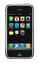
Ok, we’ve all seen what the iPhone interface looks like. In fact, that single interface shot is now legendary – reproduced in tech magazines and web comics everywhere.
So, isn’t anyone else disturbed by the odd number of icons on that interface? There is a missing icon – the last row of the main icon grid has a blank!
Now, keep in mind that the iPhone was in development when the marketing material was released. But surely Apple could have come up with one more icon to fill the void. A yellow pages icon seems like a useful feature. Even an Apple logo that did nothing would at least make the interface look less lopsided.
 Ok, I may have a slight OCD issue. But the old Apple would never have done this. The aesthetics are so important! I remember the early days of the iTunes music store, where Apple tried so hard to keep the “country” page, with all the flags of the country’s that had the iTunes Music Store, so that the icons fit a nice grid pattern.
 Even the iPhone-look-alikes that are sprouting up like something that sprouts up a lot have ensured that the grid is full. What’s up Apple?
I do realise that as Apple add more applications, the icons need to flow. But really – a first look at the device should have had a full grid of icons.
The Screen
The iPhones screen is beautiful. You sure wouldn’t want to get that baby dirty or scratched.
And there lies the problem. In order to protect that screen, you need some sort of cover. And because this is a phone, you need a cover that you can take off very quickly in order to answer or make a call.
 There are already a few cases out there for the iPhone. Here’s one. So what’s the problem? Ok, now you have a much bigger device when you include the case (and the iPhone isn’t a small pocket device already), and when the phone rings you have to unzip that case to answer it. Suddenly the phone isn’t as convenient as that Sony Ericsson you throw in your front pocket.
I’m speaking from experience here – having owned a Newton 2000 for many years with a lovely leather case. It was never convenient though – having to unzip that case in order to take a note. And the screen was no where near as pretty or sensitive as the iPhone. And it wasn’t even a phone.
 The best sort of protective case I could think of is something that covers the face and you can flip over (Old-series Star Trek communicator style) with the flick of your wrist when the phone rings.
Final Thoughts
The iPhone looks really cool. Trouble is, I live outside the US. So I won’t be seeing one of these in Australia for a year at least. And given the way smart-phones are sold here, I’ll be looking at $800, on a $90 a month phone plan for 2 years to get one. That makes the device just too expensive for me.
The Apple TV isn’t that great outside the US either – with no real H.264 content in Australia. So that’s another device that is pretty much useless to those outside the US.
There also hasn’t been much in the way of new Apple Computer hardware for a while either. And Leopard has been delayed so that Apple can focus on the iPhone – which I emphasise again is of no immediate interest to those outside the US.
Apple does run the risk of alienating all their computer users in other countries with their emphasis on devices that aren’t that useful outside the US. Hopefully things will pick up soon.

Interesting comments on the iPhone.
Before a keynote, Apple obsesses over every pixel. So it’s safe to assume that the “empty spot” on the icon grid is intentional. So if you ask why there’s an empty slot, the first answer that comes to my mind is: so that you can add a widget/program of your own choosing. That’s what it communicates to me.
A full grid is complete, a full grid doesn’t suggest that you add to it or subtract from it.
Perhaps I’ve overthought this, but looking at the 3×3 jPhone grid–which looks like a template version of the iPhone interface–makes this point especially obvious.
My thinking is that the empty spot is to accomodate where your thumb would be when holding the phone. It wouldn’t really be possible to hit that button with your thumb tip. Does that make sense to anyone? Rather than speculate, let’s just say that almighty Steve knows what we want, and what we don’t need. Kool-Aid anyone? It’s Apple flavored.
ejg2, that’s certainly one of the most interesting ideas I’ve heard on the subject. The sort of “out of the box” thinking I like to see. :)