

The next version of iPadOS and macOS is version 26 – based on the year 2026, though due toward the end of 2025. The updates (including iOS and tvOS) bring many changes already discussed on other websites. Briefly discussed by others is the inclusion of menu bars in iPadOS for the first time, though there are also changes to menus in macOS that have had less discussion. In this article I outline the changes, differences and issues with the upcoming release as they relate to the menu bar.
In a followup article I discuss, in detail, how to manipulate menu bars in your own SwiftUI programs. But first, let’s start by looking at the different menu bar implementations in the new operating systems.
The Menu Bar
Anyone who has used the Mac will be familiar with the menu bar; after all, the Mac popularised the menu bar in 1983, with the release of the Apple Lisa, and in 1984 with the more famous Apple Macintosh. It hasn’t changed terribly much over the decades; testament to the power of the menu metaphor.
Those who’ve used Microsoft Windows will also be familiar with the menu bar, though it appears on individual windows rather than always at the top of the screen as is the case on the Mac.
macOS 26
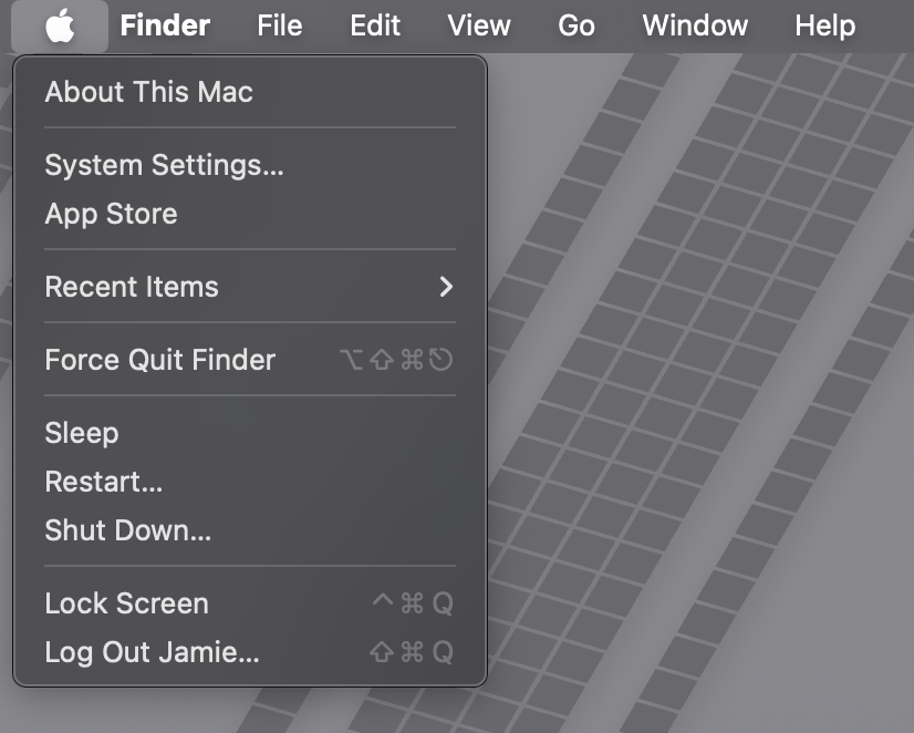
Apple’s menus have traditionally consisted of plain text and optional keyboard shortcuts, with Apple generally avoiding icons. However, in recent years, Apple has introduced SF Symbols – a standard set of thousands of icons with a clean design language that can be used by any application, ensuring consistency throughout the entire operating system. These symbols have proved extremely popular and this year, with macOS 26 (Tahoe), Apple has decided to make extensive use of them themselves by using the symbols as icons on almost every menu item on the Mac.
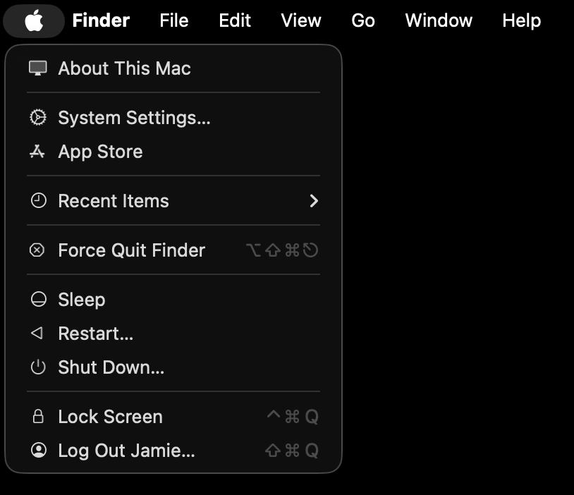
By using monochrome icons, the addition of these symbols is far less distracting than one would have expected, and has not proved overly controversial amongst long-time Mac users.
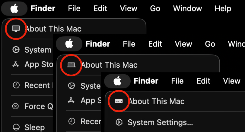
A nice touch is that the icon next to About This Mac actually changes based on the type of Mac being used. With Apple controlling both the hardware and the software of their products, this is something they can easily do and Mac users delight in.
The use of icons extends to context (pop-up/right-click) menus in macOS 26 as well.
iPadOS 26
With iPadOS 26, Apple brings the menu bar to the iPad. At first glance you may think this is just a straight port of the Mac menu bar to the iPad, but there are differences worth discussing.
First, unlike on the Mac, the iPad menu bar is not always visible. You access the menu bar by swiping down at the top of the screen.

The top-level menu items should look familiar. Unlike on the Mac, there is no always-present Apple Menu, however the other menu items follow their Mac counterparts fairly closely.

You interact with the menu bar using your finger or pointing device to open and select menu options.
Though the concept and operation is obviously similar, there are some key differences between menu bars on the Mac versus menu bars on the iPad. These differences are as of the release candidate, so may change in the final release, though unlikely.
Apple Menu – there is no system-wide Apple Menu on the iPad. To get to things like System Settings you go to the dedicated app Settings, and to shutdown or restart you either use the Control Centre, or the physical power button on the device.
App Menu – iPad OS also has an App Menu (the menu named after the application being used). Unlike on macOS, there is no About in this menu, and no Quit or other “app” functionality. At this stage there is only a Settings option for the app in question.
Further, while this menu item is called Settings… on macOS, on iPadOS it includes the name of the app – for example, Photos Settings…
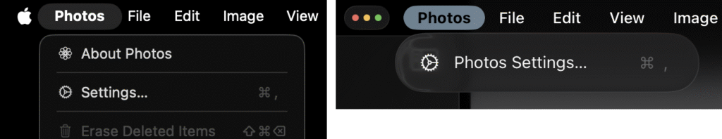
Image and View – possibly a bug, but the Image and View top-levels menus have their orders swapped on iPadOS.
Enter Full Screen – this menu option appears in the View menu on macOS, but is always in the Window menu on iPadOS. This is one of those rare moments where I’d say the Mac has this wrong, though I’d prefer they were both consistent (either wrong in the same way or right in the same way).
New Window – This menu option appears in the File menu on macOS, but is in the Window menu on iPadOS. See below for more details.
Bugs/Features
About
Within the App Menu on macOS, Apple does not appear to have decided what icon goes next to About. Most apps have no icon. Calendar has an info icon from SF Symbols. Photos seems to have its own icon that doesn’t appear to be a standard icon from SF Symbols.

So far there is no obvious documented programming API to change the About icon in your own app.
Help
Similar to the About menu item, the Help menu item on macOS has different icons.

To add to the confusion, on the iPad Apple use another icon for help in their own apps.
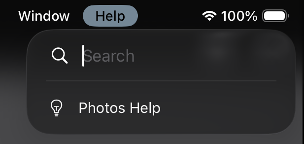
This icon represents the Tips app on the iPad, and Help launches that app. As far as I am aware, there is no ability to add your own help text to the Tips app for use in your own apps on the iPad.
Settings
Note: The following bug is fixed in the RC version of iPadOS 26, though comments are still relevant on Apple’s recommendations.
As mentioned, every app on the iPad has a Settings menu. Currently this includes the bizarre Settings Settings… menu in the Settings app.

Settings doesn’t have its own settings, so this takes you to all the settings for all apps within Settings. So not only does it look odd, but it behaves oddly too. Apple made this rod for their own back by adding the app name to the Settings text on the iPad only (which makes the option look strange), and having only one option in a menu that has to be there because it is the name of the app. The problem doesn’t exist on the Mac as you can just hide the Settings option if you have no settings, but the menu is still functional because of About, Quit and other options in that menu.
Further, the way Apple wants you to use Settings is different than how it has traditionally worked on the Mac. By default on the iPad, this menu item is in every app, and takes you to the app-specific section of the Settings app.
Apple have been pushing, since the early days of the iPhone, for apps to store all their settings in Settings. Unfortunately, this really is not a great place for all an apps settings. First, going to the settings takes you out of the app you are using, which can be disorientating. Second, the settings are presented as a boring, long list of options. It’s not user friendly, and lacks warmth or character. As a result, most third-party apps create their own settings screens within their apps.
You can, of course, just override this setting and have it open your own settings. But Apple’s documented guidelines are suggesting you don’t do that. It seems they want you to add another menu item in the App Menu for your other settings. What do you call it? I have no idea. Also, how confusing is it going to be if your app has “MyApp Settings…” and “MyApp Other Settings…“?!
Reserve the YourAppName > Settings menu item for opening your app’s page in iPadOS Settings. If your app includes its own internal preferences area, link to it with a separate menu item beneath Settings in the same group. Place any other custom app-wide configuration options in this section as well.
Apple’s Menu Bar Guidance (June 9 20925)
I can’t see Apple changing their guidelines on this unfortunately.
File and Close
Unlike Microsoft Windows, not every app on the Mac needs a File menu. If you actually think about the name of that top-level menu, it refers to the use of files. If your app has no use of files, why would you have a File menu?
This has been the case on the Mac for quite some time, and apps without a File menu tend to be what are called Single-Window Apps. Two examples you may use frequently on your Mac are Calculator and FaceTime.

These apps consist of a single window, and don’t deal in files.
If you close the Calculator window the app will quit. You can also close the window from the Window menu, where there is a Close menu item.
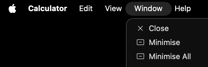
On the iPad, Calculator also has no File menu. However, it has no Close in the Window menu either. This doesn’t prevent you closing the window as you can choose to close it via the red traffic-light button in the top left of the window. It does, though, feel like an oversight.
I feel this is a bug (or oversight) in SwiftUI. Single-Window apps written for iOS/iPadOS in SwiftUI don’t seem to have a Close menu item in Window, and instead Close Window sits in File, even if you don’t deal in files. You can remove the File menu, but you still don’t get the Close menu item in Window.
My theory as to why this works in Calculator on the Mac is that I suspect Apple wrote Calculator in SwiftUI for macOS, which doesn’t have this issue. If they used Mac Catalyst (a way of compiling an iPadOS app for macOS) it would exhibit the same issue we see on iPad.
The concern here is, rather than make this work properly, Apple are going to just make every app have a File menu from now on, with Close in that menu. An example is Find My. This has a File menu that only has Close in it, on both macOS and iPadOS. I suspect it is a Mac Catalyst app on the Mac. This is sloppy (at a minimum Apple could hide the File menu here), but has been like this for a couple of macOS releases.

New Window
Even with apps that have multi-window support there is an oddity. An iPad SwiftUI app with multiple windows will have a New Window option in Window, but Close Window in File.
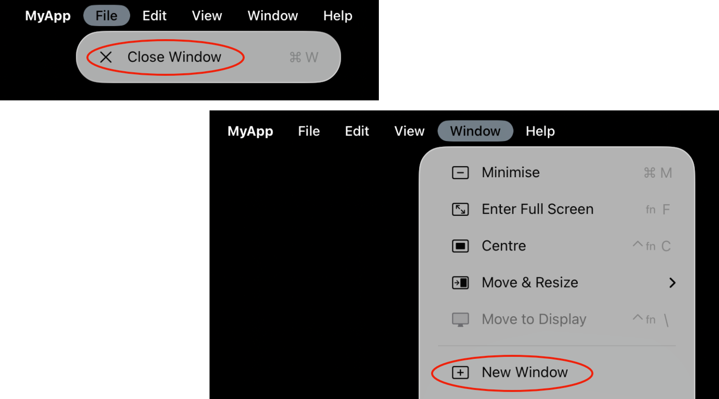
The same code compiled as a Mac Catalyst app will have New Window in File, along with Close.

There is a fair amount of inconsistency. Maybe you don’t care as you are only interested in making an iPad app. You should care, though. And in the next article I’ll show how you can make your SwiftUI iPad app a great macOS app, with very little effort. Your users will thank you.
Thanks for the headsup on this Jamie. It is interesting that Apple seem to be bringing iPadOs and MacOs toward some sort of developmental confluence. I used to thinnk that this would be a good thing. However, it may caus both OS’s to lose some of their individuality and perhaps lead eventually to restrictions in operative style. The consistency of app menus would be desirable but the problem with Window and File menus does seem a bit kludgy. Look forward to your next segment.
What do you think of the windows effect in iPadOs?
I think it is interesting that Apple tried so hard to NOT make the iPad like the Mac. Originally all apps were full screen, then they added side-by-side and slide-over so you could basically have 2 apps at once, and then they added Stage Manager last year, and a … menu at the top of the screen to close windows. And this year they gave up and said, “Just do what the Mac does”.
Listening to iPad power users, this is what they really wanted. So perhaps it gives the iPad the power to be more than just a consumption device. I find the iPad frustrating to use for real work, and much prefer the Mac. But I love the iPad for simply watching YouTube, or reading an email, or doing a web search. So the new ability to make any app a window probably will not be used by me much anyway.
Apple have said they don’t want the operating systems to merge. Windows tried it with their tablets, and it was generally not well received. So I think we’ll have to see what happens. I think added touch screens to Mac laptops would be useful, and Apple has been really stubborn not doing this.