
This week at WWDC, Steve Jobs told Mac Developers that they were offering a “sweet” way to develop applications for the iPhone. Yes, he said “sweet”. Multiple times.
Steve also told us this was an “Innovative new way” to develop applications. And that it was “Easy to update – just change the code on your own server”. Ouch! Developers were not happy. This is no way to write good applications for a device.
For a start, how do you start your great app? Well, you click on the Safari icon on the iPhone. Safari starts – possibly at your home page. You click on the Bookmarks button. You search for your application in the list. You click on the bookmark. It loads the URL.
What do you see on screen. You see a web browser screen, complete with Address Bar. At the bottom of the screen are Safari controls. Basically, you see what looks like a web page.
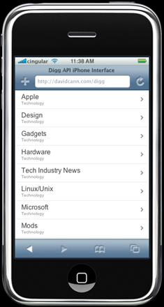 As an example, I’ll take the wonderful work of David Cann and his Digg for iPhone web application. On the iPhone we’d expect it to look something like the image on the right.
Note the Address Bar and buttons. So not only did you have to start a web browser to start the application, you have to be reminded that this isn’t a real application anyway.
Apple calls this “sweet”.
Now obviously developers would have liked something akin to Dashboard on OS X – small applications that don’t have to run off a web server somewhere. What they were told is that you have to run your own web server (and any costs associated with that) in order to offer your application to others. Not even close to ideal.
But if we accept that Apple can only provide web apps at this stage, couldn’t Apple have at least given us a more usable solution?
Making it “sweeter”
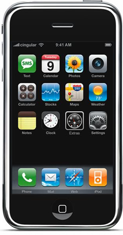
As I’ve mentioned previously, the iphone is missing an icon! That interface is all lopsided – I can’t figure out why Apple didn’t put an extra app there just so the screen shots look aesthetically pleasing from day one.
Given they’re missing an icon, Apple should add one. I’ve called it “Extras” in my mockup. It could have also been called “Widgets” or “Web apps” or something.
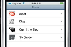 On tapping the Extras button, Apple could load up a list of special bookmarks – a bookmarks area for Extras that people have added – see the mockup on the right.
By using favicons, the applications get an icon. Sure, not as exciting as having your icon on the iPhone main interface. But at least no one has had to start a web browser and go to bookmarks.
To the end user it is like a sub folder of applications they’ve added themselves. Much like most other phones these days (my Sony Ericsson here has an Applications sub folder where I have downloaded Java applications for my phone).
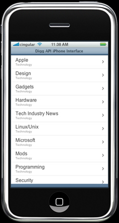 The user then taps one of the applications. At this point, Safari starts (in the background) and the web application is quietly loaded. However – here’s the big difference. The Address Bar is turned off! As are the buttons at the bottom. The end result is that this looks like a real application.
Ok, it isn’t a real application. Not even close. But at least it gives the appearance of one. It’s “sweeter” than having to go to Safari to launch your application, and requires very little work to add it to the interface. And Apple gets to make their main icon set look aesthetically better. Two birds with one stone.
Sure, adding new apps still requires browsing somewhere, and adding a bookmark to the Extras area. But there are ways to make this easier too.
To quote John Gruber, it is still a “shit sandwich”. But now it would at least have some sugar on it. :-)
Pingback:iPhone » Blog Archive » iPhone Development: Not so sweet
guys, I found an article on iPhone development. It contains really practical tips. http://techzone.enterra-inc.com/iphone/custom-camera-applications-development-using-iphone-sdk/
I liked it. It’s interesting and really understandable even for Junior Developer.
Developing for the apple iPhone can be a real pain. From apple’s strict privacy policy to the unique code that needs to be written. But if you make a good app, sell 100,000 at a $1 a piece… you get the picture. High risk high reward!