 As I discussed recently, Apple last week told developers that writing web apps for the iPhone was the “modern” way to write great apps, and it was a “sweet” solution. I, and others, suggested this was not so “sweet”, and I outlined an attempt to “sweeten” the solution – though pointing out the solution still wasn’t so great.
I got a great number of readers of that article – and while most people agreed with me, a few declared that Apple was right – this is the way to write modern applications.
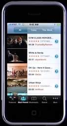
Well, this week Apple added YouTube to the iPhone.
You’ll note it is not a web app. Apparently web apps are the modern way to write apps, unless you’re Apple in which case you write apps the old fashioned way. Apple doesn’t eat it’s own dog food it seems.
Why isn’t YouTube a web application?
Ok – there are arguments as to why this has to be a “real” application. For a start – Safari doesn’t support Flash. Does it support H.264 video playback in the browser? We know the phone does, and we know that Apple have arranged for YouTube to encode all video in H.264. So Apple could have, theoretically, written a web app that used streaming H.264 video from YouTube. But they didn’t. Maybe Safari can’t play video files either – even H.264 ones?
Regardless, you can see that even if Safari could play Flash or H.264 video, the YouTube player would never be a web app that runs from Safari. The reason is obvious: that would suck! For a start, you’d have to go to Safari, go to your bookmarks, add Apple’s YouTube web app to your bookmarks, and launch it from there whenever you wanted to use it.
But apparently Apple’s developers have to do it this way.
The missing icon
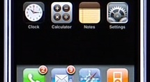
Now, I’ve complained before about the odd looking interface, with a seemingly missing icon. With the addition of YouTube, aesthetically everything looks much better. That’s one minor victory.
There is room for 4 more applications it seems below the 12 current icons, before you require some sort of scrolling to see or choose other applications. So Apple has to think about this interface at some point. Just filling it with heaps of icons you don’t particularly want isn’t so great.

And really, some of the applications are not for your average user already. Stocks, for example. Not everyone watches or uses the stock market. And when it comes to releasing the device in other countries, is the Stock application going to work in those countries? The one in Mac OS X doesn’t seem to work with all the stocks on the Australian Stock Exchange – and that widget has been out for a couple of years now.
Is YouTube something that should take pride of place on the front of the phone? Good for marketing I guess, but in reality it is just a way to pass the time.
Surely there are obvious applications that a device like this could do with, and doesn’t have. I can think of two:
- iChat – an IM client that works when using WiFi. Audio chats should also be available, though video won’t work as the camera is on the wrong side. Possibly the mobile networks wouldn’t like this though, as it means you could communicate without using the network when at home or in the office. Similarly using Skype.
- White/Yellow Pages – want to look up a phone number? A White/Yellow Pages application on the Home page of the iPhone seems obvious. I would think Google Maps doesn’t have all businesses listed, and it certainly doesn’t have phone numbers for individuals like a White Pages application would have. In some countries Google Maps probably won’t work for business search anyway.
The Extras menu
 So basically, I still believe the Extras menu should come in to play here.
In the Extras menu, put YouTube, Stocks, and any other real applications as they are developed (iChat, Skype, etc.) that aren’t “core” to operation of the phone. Also, add a “Web Applications” link that goes straight to a list of “Web applications” as I discussed previously.
Games could go in here too, since rumour has it that games are coming to the phone. Unless Apple want you to go through the iPod link to get to games.
And add White/Yellow Pages to the Home Screen, so the screen still looks aesthetically pleasing, and there is a useful application from start up.
I’m sure someone will abuse me in the comments once again though, as I’ve dared to suggest ideas for improving on an Apple product. :)

The “missing icon” was planned all along imo. Just like the remaining room underneath the last row. With Apple’s attention to detail, do you really think this was an oversight?
Schiller’s marketing machine is in full swing.
I’m not sure. The “secret” features revealed for Leopard looked a lot like an oversight to me.
Apple’s attention to detail has been a bit lacking lately…
I was really hoping for the “Extras” icon. While all of the “Application Lists” at iPhone Testing Platformare great, they are also still lacking that integration we need.
jumped the gun a bit didn’t you? Apple is indeed programming apps in Ajax for the iPhone – gee, It’s got to suck when you make pronouncements sans evidence and then are proven wrong.
Er…no. I followed up on my blog with that news. And further, it still doesn’t take away from the fact that Apple didn’t do the YouTube app as a web service, because that would have been a poor user experience. Everyone else, though, is stuck with the poor user experience for their applications.
Much as I like Apple, they don’t always get it right.