
Last Friday, Apple released the long awaited new version of Mac OS X – Mac OS X 10.5 Leopard.
Ars Technica has a fantastic review on Leopard – beyond what I was intending to write. So I thought, in typical Curmi fashion, I’d write about what I don’t like. :-)
First though, Leopard is a great OS. The underpinnings are fantastic. And it has some great new features – Time Machine is genius (and if you think all it is is file backup like Windows, you need to actually read about why it is different), and I don’t know how I ever lived without Quick Look. Mail enhancements are great, iChat enhancement are great. Basically there are lots of little application changes that have really improved the OS.
Where it all goes horribly wrong is in some of the interface changes Apple has made. I thought I’d concentrate on a few here.
A New Desktop
What’s in a default background? Quite a lot really. Every release of OS X has had a default background – usually an abstract blue. Not overly busy, and fairly regular in colour. Always quite professional looking too.
For Leopard Apple made a change. In Steve Jobs’ words:
“We decided not to make a blue wallpaper for Leopard because nobody used it. We found people used their own digital photos.”
I’ve seen a lot of people using the default blue background over the years, including myself, so I’d like to see Apple’s research here. However, Apple misses the point. It isn’t about people changing their backgrounds – they are free to do that. It is all about first impressions.
And you don’t get a second chance to make a first impression.
So, first Apple announced the default background would be wet green grass.

When the developers were shown this at the World Wide Developers Conference, they actually laughed. Laughed at Steve! Seriously. Out loud. It looked like Windows XP – surely Apple were joking?!
Maybe Apple listened. At some point, they decided to instead settle on a space theme. Certainly better than wet green grass. So now we have a pinky-purple star spotted background. Yes, a space theme. The future is here – the Space Age has arrived. OS X now reminds me of my bedroom. When I was 11. Yay.

Ok, sure it was supposed to match the Time Machine theme – which has a space background. But you have to remember, this is what people first see when they go in to an Apple store. It is very geeky. It looks like a video game. And now I have to ask, why is there a shelf at the bottom of the screen – floating in space? How does that make sense?! More on that “shelf” later.
Apple should have given us a nice reflective spaceship at the bottom of the screen instead. That would make as much sense.
The Menu Bar
As Mac users know, there is only one menu bar on the Mac. It sits at the top of the screen. It has been there from the beginning, and it changes depending on what Application you are currently using.
Someone at Apple decided it would be a good idea to make this menu bar translucent. Why? Apparently having a clean, easy to read menu bar is no good. You need something that shows the background – just a little bit. Why have good readability when you can have a cool effect?
Here’s my menu bar with the default space background.

So, notice anything about the View menu?

What’s that white blob? A dead pixel!? On my new MacBook Pro?
No, it’s not. It’s a star from the default background shining through right on my View menu. Every time I look at it, it makes me think I have dead or stuck pixels. So, it looks like Steve was right – I need to change my background to a photo of my own after all, just to escape the dead pixel look!
The New Dock
Enter the new Dock – that floating shelf I mentioned earlier.
For those who don’t know, the Dock is a combined Application launcher and minimised window holder application that, by default, sits at the bottom of the OS X desktop.
For Leopard, Apple decided to make the dock fake-3D. Rather than a box at the bottom, they made it a shelf. So the icons appear to sit on this shelf. And for good measure, they made the shelf take up more room vertically. For a reason…
You see, Apple decided that all these icons would have reflections – so the shelf is now a glass type shelf, and takes up more room so you can see the reflection. And then some bright spark at Apple said “Let’s also reflect any windows above the shelf in the shelf!”.
Just because you can do it doesn’t mean you should do it. Now you have this blob at the bottom of the screen that is glossy and distracting. As you move windows towards it, suddenly you have weird reflections of your windows grabbing your attention at the bottom of the screen.

The Dock lets you know when something needs your attention – by bouncing icons up and down. It’s a very effective way to alert you. This means that you don’t expect the dock to move unless something is up. But now, say you are typing in a window, and you get close to the Dock at the bottom of the screen. Suddenly your typing is reflected in the Dock! And this subtle movement below you makes you think the OS is alerting you to something!
So far, we’ve been forced to change the default background. And now, you need to hide the Dock. Or hack it.
Then you have the little lights at the bottom of the icons. The little blue lights. They show which applications are running. Trouble is, they are just too subtle. You have to look carefully at times to see them. And given the Dock reflects everything, you have to wonder if they are just a reflection of your background, or your windows.
And if your icon has blue in it, the blue light can look like it is actually a reflection of the icon!

Once again, there are hacks to try and fix this. But overall, we’ve gone from an elegant interface to gloss for the sake of it, with no thought to usability.
Stacks
Which brings me to Stacks.
Stacks sound ok on paper. And it probably would be ok if the implementation didn’t suck so much, wasn’t so buggy, and had some options to actually make it more usable. As it is, it appears rushed, and not particularly well thought out. This is probably my least loved change in the OS.
In previous versions of OS X, you could drag folders to the right of your Dock. This gave you easy access to folder contents – click on them once, and you get a Finder window. Or right click, and you get a pop up menu for accessing the contents.
Leopard changed all that. With Leopard, when you drag a folder to the Dock, you get a Stack. A Stack appears as a stack of the items within the folder. Once again, this sound quite good on paper. But let’s see the implementation.
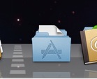
After upgrading to Leopard, the right of my Dock looks like this:

What you are looking at is part of Time Machine’s icon, the Address Book, and then…stuff. You might guess that the first stack is Applications – that’s because it has the Address Book in it. Though you could be forgiven for thinking I had my Address Book in the Dock twice somehow. After that, who knows. I can’t tell either without scrubbing my mouse cursor over them. You see, rather than show a folder icon which indicates the type of folder, instead I just see a little of what is inside.
In fact, the stacks are, in order left to right, Applications, Documents, Developer, and Downloads.
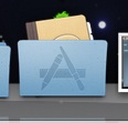
And if you still don’t see a problem, look what happens if you put your Home folder in the Dock.
Why does my Home folder look like an Applications folder? Well, it has an Applications folder in it, and that is the first icon displayed.
Did anyone really think this through at Apple?
In my blog I try to come up with suggestions on how to improve things rather than just criticising, so here’s the best I could come up with. The following is how you can improve Stacks so that your Dock makes more sense.
Take the Applications folder. Make a new Folder, and call it ” Applications”. With a space before the A. Now you need to copy the folder icon from your real Applications folder (go to Get Info on the folder, select the icon in the Info window, CMD-C), then do the same on the new folder, but paste the icon on with CMD-V. Now place this new folder in the Applications folder.
Do the same for the other folders, except for Downloads.
Now make sure each of these folders is set up to sort by Name (except Downloads). The space in front of these new folders you’ve put in the folders ensures they appear first when sorted by Name. The result is something like the following:

The result is that you now have visual indication of what folder is in the Dock. Suddenly things are a lot more usable. Downloads is the only messy Stack, and if you let it sort by Date Added it is fairly useful.
Of course it isn’t perfect. First, you have an extra folder in your folders. And the folder icon displayed is on top of the stack – it would probably make more sense to have a folder, with all the items stacked inside it. With Photoshop, Gimp, or some other graphics editing tool, you can edit a folder icon to remove the “back”, and then use that. Here’s an example I did to test this out:
It would be even better if there was a back folder part behind the stack of objects in the folder – but that may be asking too much. It would require Apple to come up with an icon format that had layers – so you could design a front and back layer, and then the Dock would have to be smart enough to layer the items in the correct order. It would have been very cool to have seen Apple do something like that though.
Stacks of Bugs
This isn’t a beta, but Stacks is very buggy. I’ve logged a couple of bugs already with Apple. For example, hide extensions in a Stack’s folder, and the changes aren’t reflected in the Stack unless you kill the Stack and let it restart. More annoyingly, copy an Application to a Stack and you get a broken icon that can only be fixed by restarting the Dock.

How could that have not been noticed in the beta?
And if you select a folder in a Stack, you get a Finder window, not another Stack view. Apparently this didn’t work this way in the first beta, but someone decided it should work this way in subsequent betas. Yet everyone I’ve spoken to has complained that if they have their Applications folder in the Stack, and they choose Utilities from the Stack grid, it brings up a Finder window rather than another grid.
Stacks Missing
When is it a good idea to take away functionality people were using? You can no longer have Finder windows open directly from a click of a folder in your Dock. And you can no longer right click on a folder in the Dock to get a cascading menu of items – including sub folders. Why not provide an option to let people have some of the original functionality.
In fact, why not an option to let people see the folder icon on certain Stacks, as I’ve hacked above. It’s pretty clear that a mess of documents visually only shows you have a folder of some sort there.
Overall, Stacks is just a poor showing. The biggest disappointment of Leopard. And it certainly is not the Piles interface that people had hoped for (and Stacks ideas came from). A real shame.
Well, that’s it. Still, Leopard is a good upgrade. It just happens to have some of the poorest interface updates we’ve seen in OS X for a long time. I’d still recommend people upgrading because of some of the great features, and some of the great applications that will be out soon that are Leopard only, and take advantage of the underpinnings I’ve mentioned. However – something has to be done at Apple to stop poor usability creeping back in to OS X. If Apple have taken the original Tiger usability guys off to work on the iPhone, get them back on OS X as soon as possible. And don’t let that Windows programmer you hired over the summer near OS X ever again!
Agreed. Name and shame that windows programmer, Jamie! He deserves it.
i have many of the same complaints. if you want a folder in the dock that works the way old folders used to, simply put an alias of the folder in the dock. click it, and the folder will open in the finder.
to maintain the stack functionality but solve the icon problem is a bit more work… alias everything in the folder and move it into a new empty folder. make the icon of everything in the folder the same (whatever you want the icon to be). send it to the dock.
Great tip Bottlecap. I’ve also found that Smart Folders behave like Aliases in the Dock, so do not act as Stacks. This may also be useful.